
In this article, Iyar Lin, data science lead at Loops, goes through the “behind the scenes” of one of our most used types of analyses: Release Impact.
A/B tests are the gold standard for estimating causal effects in product analysis. But in many cases, they aren’t feasible. In this post, I’d like to discuss one of those cases which constitutes a significant pain point for many companies I’ve worked with: The feature release impact.
Quite often, a company would release a new product feature or a new app version, without running an A/B test to assess its impact on its main KPIs. That could be due to many reasons, such as low traffic or too high technical complexity.
To get some sense of the release impact the usual practice would be to perform a “before-after” analysis: compare the KPI a short period after the launch to the same period before.
But such comparisons may overlook important sources of bias, leading to a false sense of confidence or even a wrongful rollback of a feature.
Below I’ll discuss 2 of the most common sources of bias:
Bias 1: Time effects
One of our clients released a new product feature. To estimate it’s impact the product managers did a simple before-after analysis and found that the main KPI was 3% higher in the period following the release, compared with the same period prior.
But when they were presented with a plot of the KPI over time in our platform they were up for a disappointing reckoning:
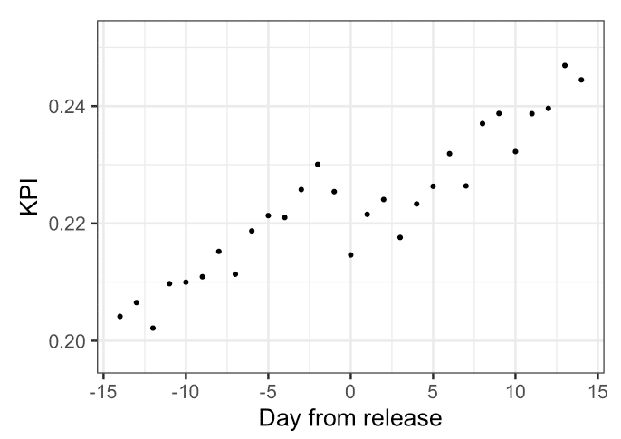
As you can see in the plot above, the KPI is on an upward trend throughout the period regardless of the release, whereas the release itself has had a negative impact. The simple before-after comparison assumes no time dynamics which in cases like the above can lead to erroneous conclusions.
Bias 2: Change in mix of business
While time effects can be quite visible, others might be more subtle.
When another client made a similar comparison to test the impact of their feature release, they saw a negative release impact of 2%. The company’s feature release seemed to have a negative impact. Plotting the KPI over time didn’t help find an explanation either:
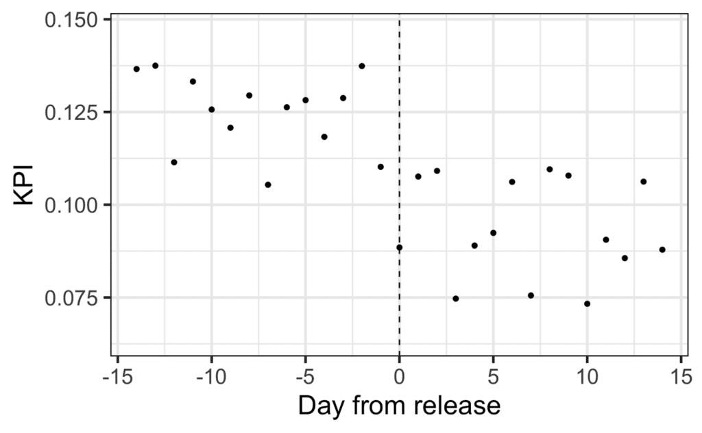
Many companies would stop here and assume the release was bad and needed to be rolled back.
But when they fed their data to our platform it uncovered a curious phenomenon: The proportion of Android users has risen significantly compared with the period before the release.
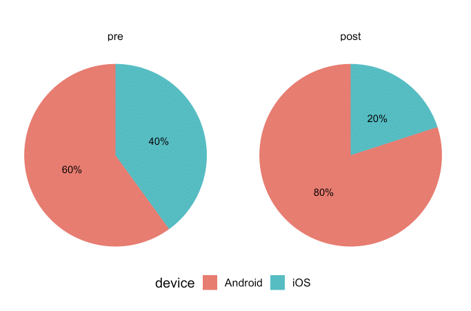
Why is this interesting? Because in this specific example, those Android users tend to convert less than iOS users. When the platform presented them with a plot of the KPI over time within those two groups, it became clear that the release impact was positive after all (If you need clarification on how that’s possible, check out Simpson’s paradox).

Does that mean we can’t do without A/B tests?
The above cases were relatively simple. Time effects can include complex trends and daily seasonality, segment proportion changes can be more subtle and spread across many subsets, there could be interactions between segments and time effects, and more.
If these simple examples were enough to deceive even seasoned product managers, how can one have any hope of dealing with much more complex phenomena?
Enter the Release Impact Algorithm
While there’s never a silver bullet solution, during my work at Loops, we’ve developed an algorithm that transparently and automatically deals with the above biases. I can’t share the full implementation details for business and IP reasons, but below I present a general overview.
The algorithm has three stages:
- Use an ML algorithm to find segments whose proportion in the population changed the most between the pre and post-release periods.
- Model time trends and seasonality along with the release impact **separately** within each segment.
- Take a weighted average of the release impact estimated within all segments to arrive at the final impact estimate.
Testing the algorithm validity
You can never know for sure if any method works on a particular dataset. You can however get a rough estimate by using past A/B tests. For example, an A/B test with control and treatment populations was executed for some period. Comparing the average KPI between those two groups yields an **unbiased** estimate of the actual impact. This serves as our “Gold standard.”
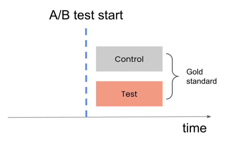
We’ll name the segment of users in the period before the test “pre-control.”
Comparing the pre-control population to the treatment population is analogous to the comparison we do in a before-after analysis.
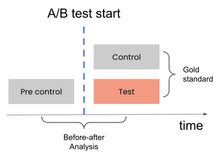
Using many different tests, we can compare the “Gold standard” estimates with the “before-after” estimates to see how close they tend to be.
Working at Loops I have access to hundreds of A/B tests from dozens of clients using our system. Using the above method, we’ve found that the algorithm has vastly superior accuracy to a simple before-after comparison. This algorithm is now an integral part of Loops’ release impact analysis.
Investing resources wisely
Next time you do a “before-after” analysis, account for the biases introduced by time and changes in mix of business. Simply conducting a before-after comparison runs the risk of providing a false sense of confidence or wrongful feature rollback.
There’s a more underlying issue with how you look at data. You spend tons of R&D and product resources on building features that should move your metrics. But with the naive method I described, you don’t know if your actions impact your KPIs the way you want, you don’t learn, and you can’t improve. In other words, you just shoot in the dark, hoping for the best.
But as I’ve demonstrated, there’re ways to ensure your resources are invested more thoughtfully and justifiably.
Contact us, and we’ll help you see how you can make better product decisions with Loops.